A surprising color story is emerging
I thought that this morning would be a good time to do a sewing room update/recap, since it has been awhile. For the past 3 months or so, I’ve been doing a lot of traveling and speaking with guilds on many topics, including the Capsule Stash project. I’ve been my own best marketing person. My schedule has now pivoted to a summer schedule, and I’ll be working on creating more content as my piece of the renovation project wraps up. I’m not posting photos of the during, but there’s plenty of photos and videos planned for the reveal.
As of now, the construction is done, the HVAC is in, the flooring is done, the staircase has been rebuilt and painted, and the cabinetry is in. I have so much lighting installed that I am no longer worried about that. Finishing a project such has this takes a lot of drying time, and we’re fitting that part in as we can. But as we have worked through this, there’s a surprising color story emerging. That’s what I’d like to focus on today - I love where this is going, but I did not have purple on my bingo card. And yet, it keeps showing up.
This photo is in the current workspace - you can tell by the yellow walls. They are not coming with me.
Picking color for a quilt space which is below grade with no natural light source was not something I undertook lightly. Making a mistake in that area frankly terrified me, and that’s not something that color usually does to me. I went with Benjami Moore’s Swiss Coffee (it turns out that every paint company has a version of this one) for trim, the ceiling and two of the walls. In the beginning, I thought of it as a safe choice…but I’ve now redefined it as the smart choice. At the moment it looks like a white box, but there’s enough color coming into the space that I’m not worried about that.
One thing not coming down with me is the two white Ikea bookshelves that often appear in photos as backdrops when I I’m teaching zoom classes. They were used when we picked them up, and they are a tad too small to hold my quilts, which are coming into the space with me. I’ve had custom cabinetry built into the space which will give me more storage (can you ever have enough?) on the back wall of the space. They are gorgeous, they are huge, and they are going to be painted Honest Blue by Sherwin Williams (color matched to Benjamin Moore brand). I can’t tell you how many versioins of French or Powder blue I searched online, but when I saw this (not a hint of gray undertones) I knew I had it. It’s gorgeous…and that will be the backdrop for the yardage and the quilts on the back wall. If you’ve known me for a while, you know that Blue and yellow is my favorite color combination, so putting blue in there isn’t a total shock.
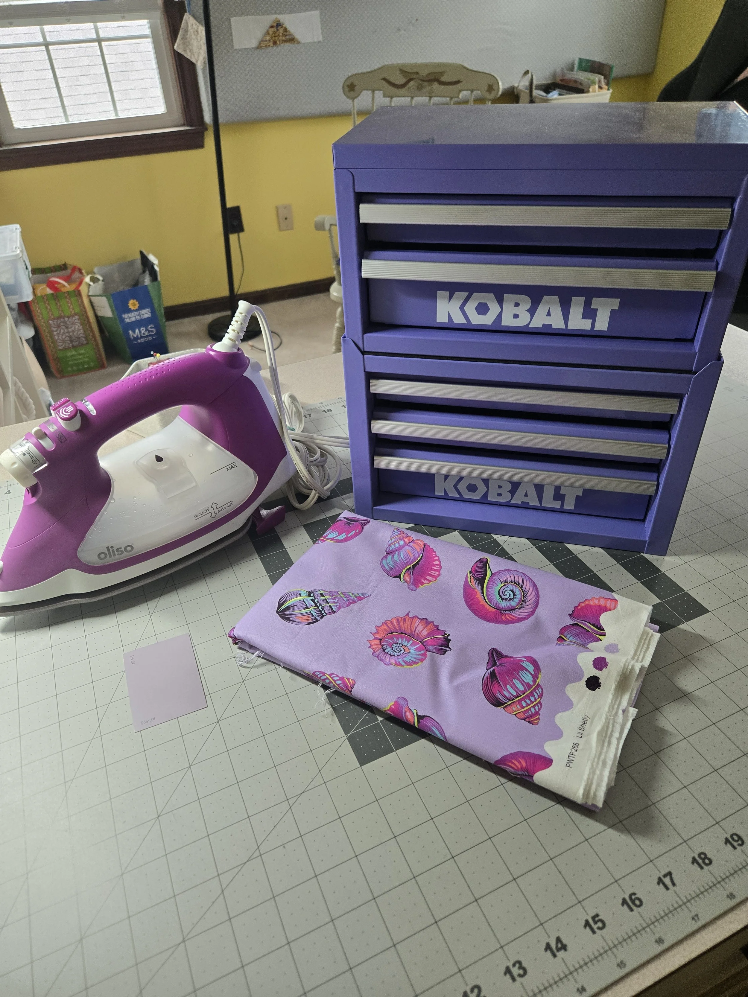
One of the most surprising things that has come out of this renovation project is the color of the space. One of the things that is the most surprising was the accent color that (judging by the photo above, more or less picked me. I am not sure how, but the third dominant color in the space is in fact purple - in several different iterations and shades. Mike bought me the small toolbox (which is perfect!) for the space for Christmas, and he told me he picked purple because he thought it looked like me. I purchased an Oliso iron when I was in Hartford in April, and the purple color came home with me. And then, there’s the paint chip in the photo…
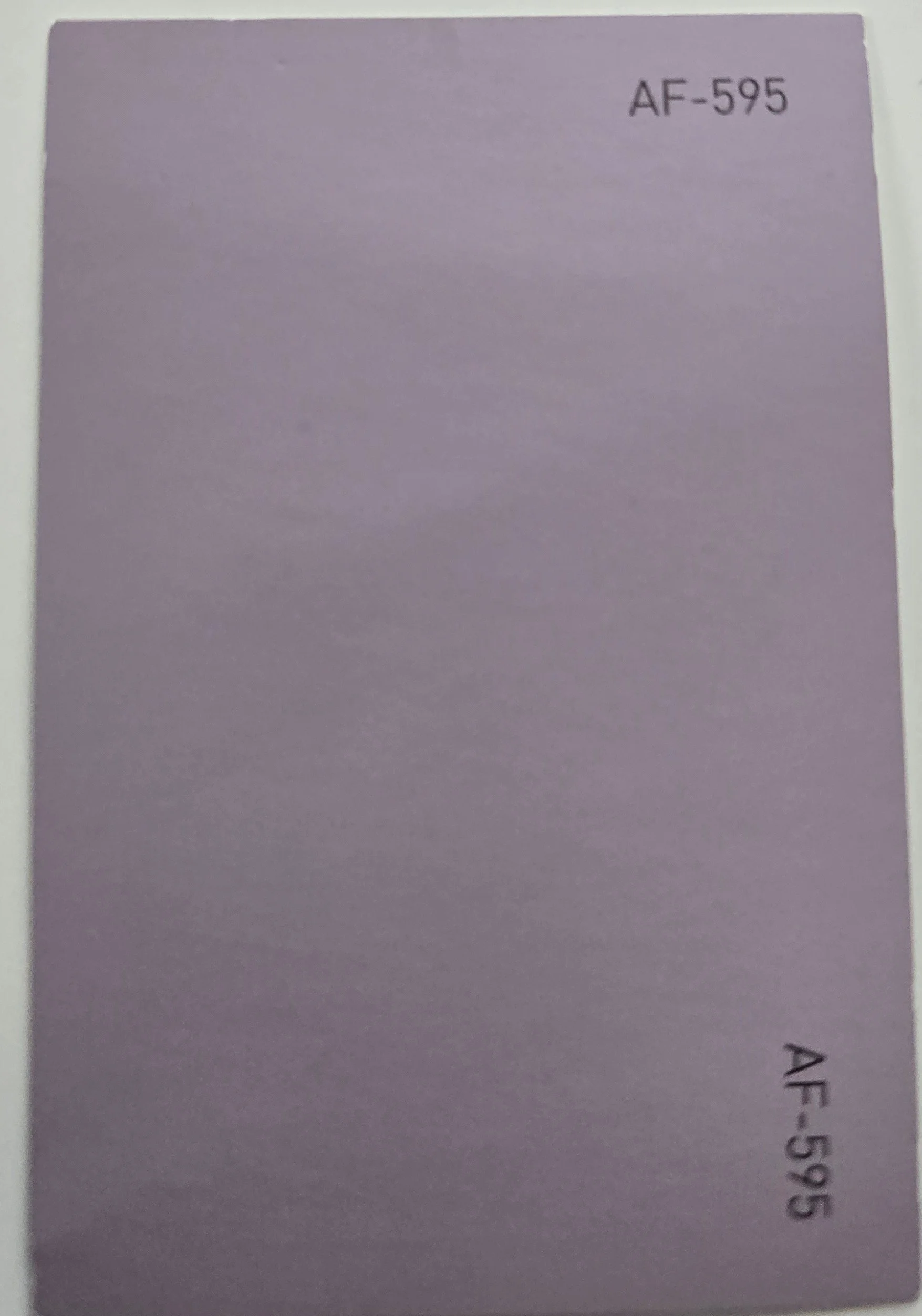
This paint color more or less jumped out at the paint store and said take me home.
This is Benjamin Moore’s color Inspired.
The name on the tag made me look at it twice, and it’s just enough of the unexpected. This is going on the staircase wall, opposite to the cabinetry, and it’s a small wall.
Definitely an accent, but one which makes me smile.
My current space (the big yellow room) is a bit of a hot mess at the moment, and over the weekend I had my first big realization that my big board isn’t going to fit. I absolutely will have a large permanent ironing station in the new space, but the big board I have is too big, and won’t work as I had intended. It’s one of the TNT Quilt Boards, very well made, and I have loved having it here. I’m continuing to work hard to get all my functions into the space, and the ironing space is one on my must have lists. It’s been sold to a Quilter’s Retreat house where I know it’s going to be well loved.
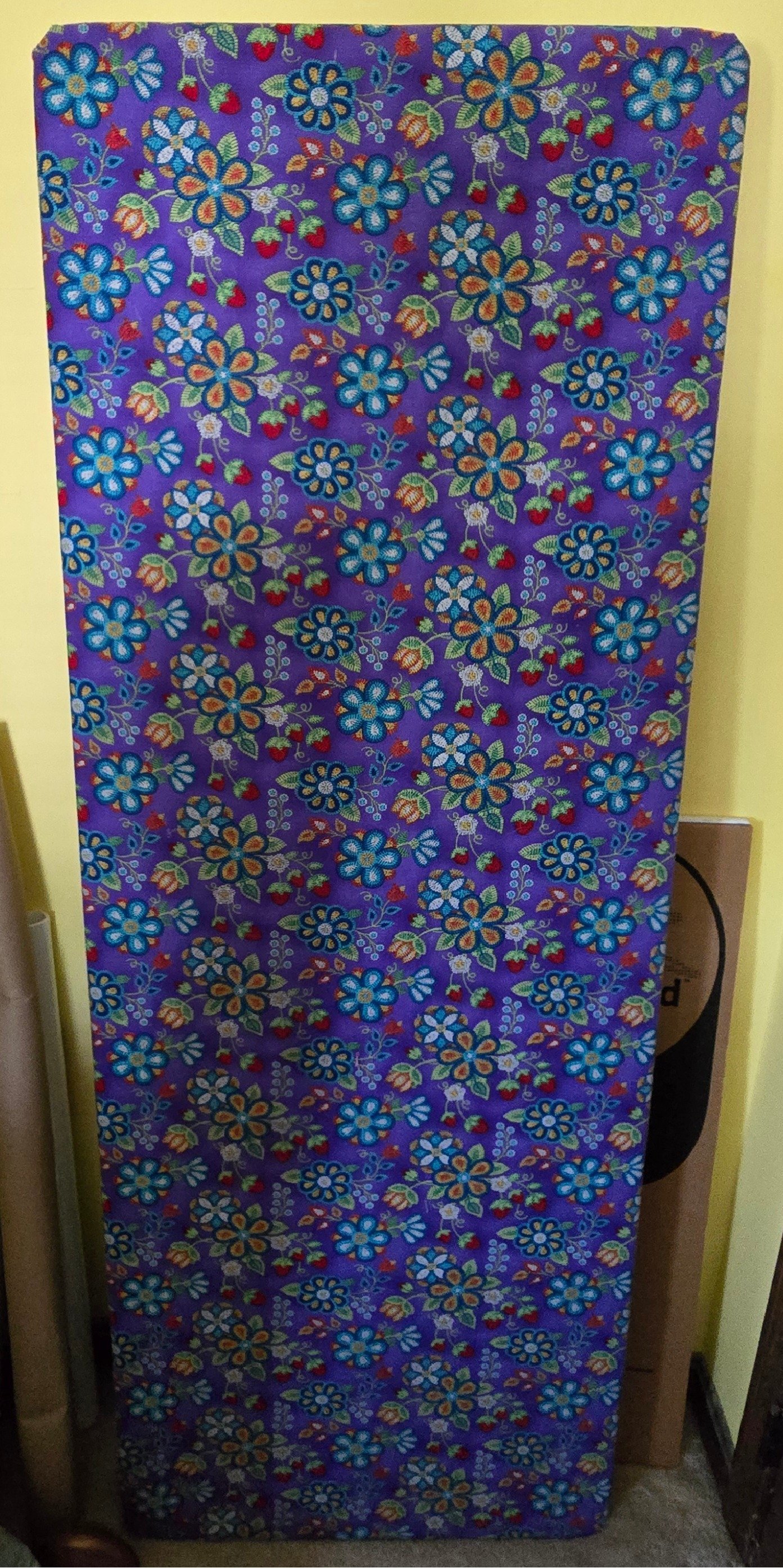
Even though it’s purple, and I bought this one because I loved the print, it’s not going with me to the new space.
The functionality is going, but this is too big for the new space. It’s going to go live it’s Best Life at a Retreat House for Quilters.
In the next update, I’ll give you a look at the “what was I thinking” files when I tried (and failed) to pick a rug for the space. Until next time…